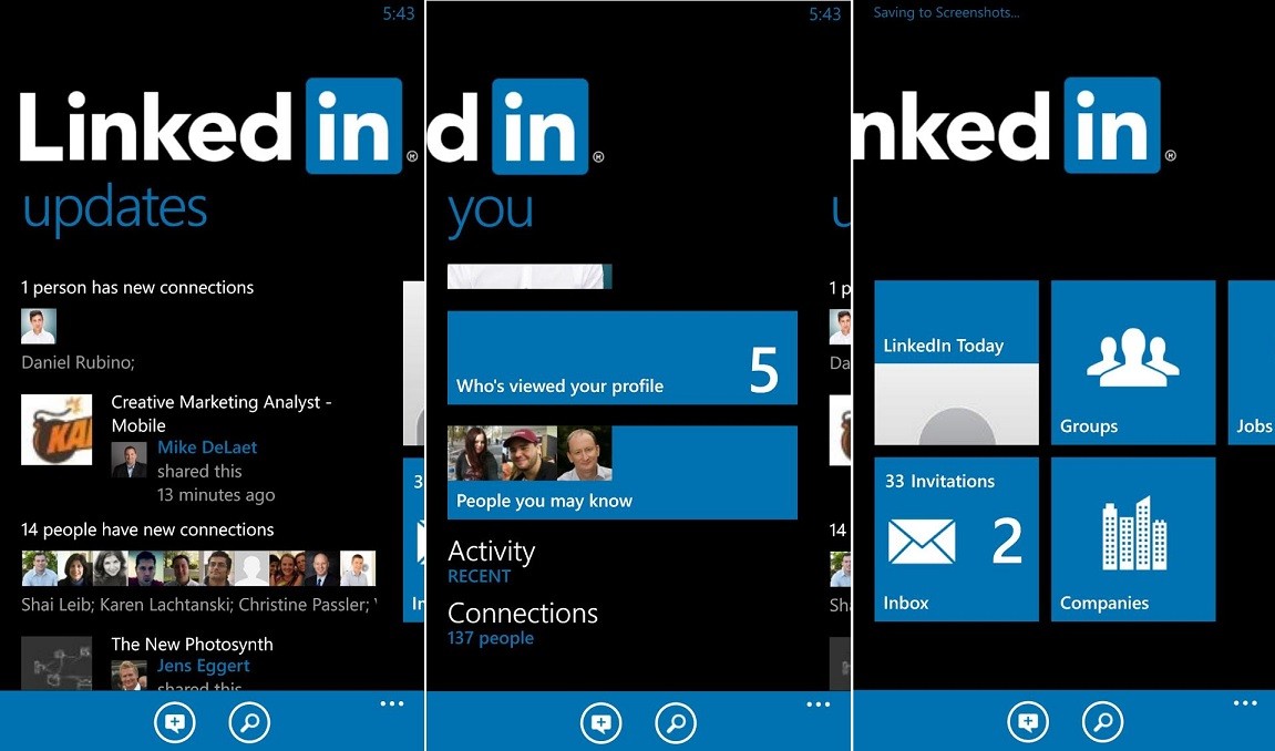
Are you a LinkedIn member? Are you aware of the new site design for LinkedIn? Yes, LinkedIn rolled out a new design coupled with a complete rebuild of its technology framework.

The rebuild takes the LinkedIn desktop in accordance with the mobile version introduced in 2015. LinkedIn will launch its new update in coming weeks globally.
Let’s take a glance at the redesign in short. Few changes are listed below.
- Streamlined navigation bar: The navigation bar is now provided with 7 core parts, which are Messaging, Home, Me, My Network, Notifications, Jobs, and Search.
- Smarter messaging: A real-time platform with more robust abilities, which includes enabling the identification of people in the user’s network who work in a company the user would be interested in working.
- Richer feed: Significant content for users through a blend of human editors and algorithms.
- Better instinctive search: A single general search box with filter options.
- Added information: More information, for example, who has peeked into the user’s details.
- Enhanced profile suggestions.
Principal analyst at the Enderle Group, Rob Enderle, said, “The redesign is informative and clean, and can be visited more regularly”. Thus, LinkedIn users may find the improved messaging attribute helpful, as it enables the user to read and send messages while continuing with their feed. As the new attributes of LinkedIn are business-oriented and may enhance engagement, Enderle commented that the rebuild is “an encouraging transform for the network.”

So, when are you updating your LinkedIn? Update and get back to us with your comments whether it is feasible to use. Feel free to share your thoughts.
